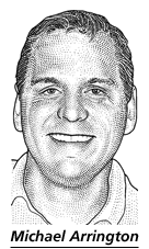
 You have probably seen this pen and ink drawing of Michael Arrington in a recent story about Techcrunch published in The Wall Street Journal.
 These distinctive dot sketch portraits of celebrities in the WSJ are popularly known as HedCut drawings composed only of tiny ink dots and lines and is unique to the paper. They are drawn by hand [no computers] using just pencils for tracing and ink pens to emulate the look of woodcuts from old-style newspapers, and engravings on certificates and currency.
Wall St. Journal editors have had no love for real pictures since they felt that one word was worth a thousand pictures. Most of the pages on the WSJ don't have photographs except for showing advertisements. So their artists gave birth to a new HedCut style of portraits or dot drawings which maintained their "no-picture policy on Page 1" and also preserved the gray appearance of the paper.
Now the WSJ has a small in-house art staff for drawing these HedCut portraits. Each headiest drawing in The WSJ takes between three to five hours to produce. Great attention is paid to shadows and highlights. Women are often more difficult to depict than men, due to their more complicated haircuts.

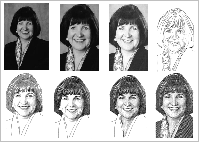
This PDF document on Dow Jones site, titled How a Photo becomes a Wall Street Journal HedCut, provide a glimpse on what goes behind the scenes to convert a regular photograph into a Wall Street Journal portrait in 5 steps.
The Journal’s graphic style calls for a gray, evenly developed drawing, so the illustrator darkens shadowy areas with a combination of parallel counter lines, cross-hatching and dotting technique.But don't waste your time looking for Photoshop plugins or software to convert your photos into Wall Street Journal style illustrations - chances are that you won't find any.
But if you still want to have your own Wall street style portrait, either create a company like Yahoo or Youtube to attract Wall Street reporters. If that sounds too big, take the services of popular stippling artists like Kevin Sprouls, Randy and Noli Novak who create most of these iconic style Hedcut drawings for the Wall Str. Journal.